
Role
Team Leader, researcher, and designer on a three person team.
Timeline
One week design sprint.
Skills
Competitive Analysis, Design Sprints, Figma, and Photoshop.
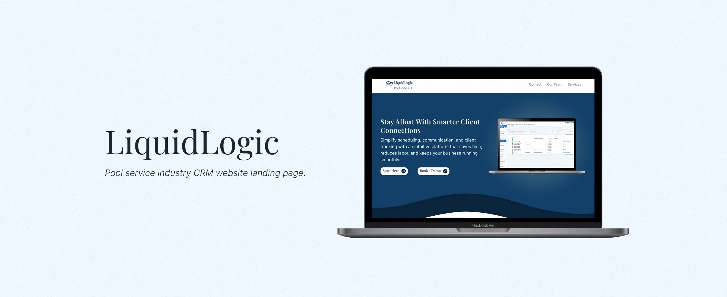
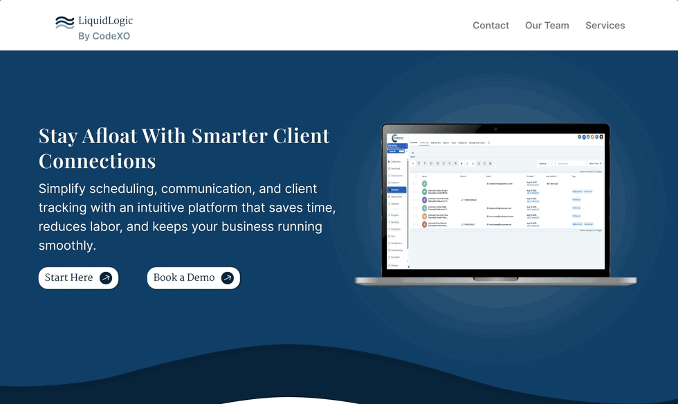
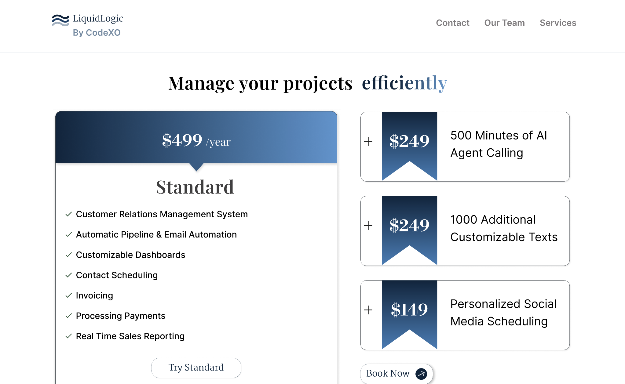
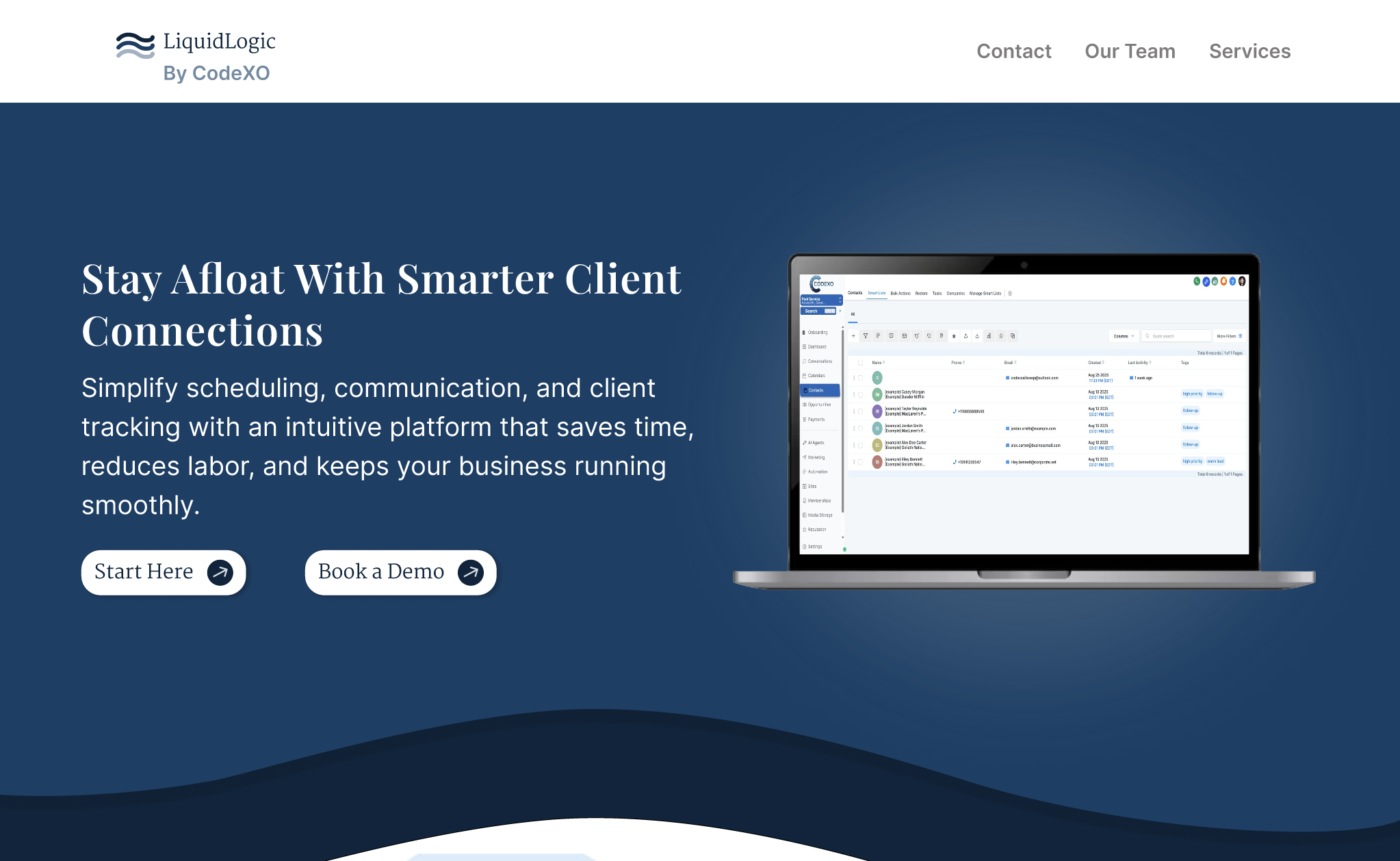
We created a landing page to educate potential clients on Codexo’s pool based CRM software.
The Overview
Over a one-week design sprint, my team and I designed a high-fidelity interactive prototype for Codexo’s pool service industry CRM platform. The challenge was translating a complex AI-powered system into something approachable for users unfamiliar with CRM tools, while clearly communicating the product’s strengths. To inform our approach, we conducted a focused competitive analysis to better understand user needs and how existing CRM platforms position themselves in the market.
How might we help new users understand and confidently navigate an AI-powered CRM platform?.
The Problem
The Target Users
Pool management companies
Managers
CEOs of pool companies
The Stakeholders
CodeXO’s CEO: Kyle Kerns.
We combined competitive analysis with digital ethnography to understand user expectations, behaviors, and how existing CRM platforms position themselves in the market.
The Research
Goals
Understand what is essential when introducing information on customer relationship management systems.
Gauge users of other products frustrations with said products.
Determine strengths and weaknesses in information design of other products.
Results
We found that other companies highlighted numbers and research backed successes of their products.
Users of similar products discussed the cost of service front and center when discussing pros and cons of the products.
The Findings
CRM companies tend to focus on performance metrics and research-backed success stories in their messaging. However, users consistently prioritize cost as a key factor when evaluating these tools.
While Skimmer CRM is highly visible in search results, community discussions indicate many users ultimately migrate to more affordable alternatives.
Customization limitations are a common frustration, with users noting that each platform has distinct “quirks” that affect usability.
Persona Creation
Blue Collar Bill: a persona created from market research and stakeholder interviews.
Name: Blue Collar Bill
Age: 48 years old
Occupation: Brand Ambassador for ShinyBluePools
Goals: Wants to build more client relations with less labor
Struggles: Does not understand AI technology and is not familiar with complicated UI layouts.
Aspirations: Wants to easily book meetings to streamline CRM and spend more time out on the field instead of on call in the office.
Scenario: Blue Collar Bill operates multiple businesses, including a pool renovation company in South Florida, where he manages a client base of roughly 100 customers while balancing daily operations.
In search of tools to improve efficiency, he discovers the Codexo pool CRM website. He quickly scans the services, pricing tiers, and company information to assess whether the platform aligns with his needs.
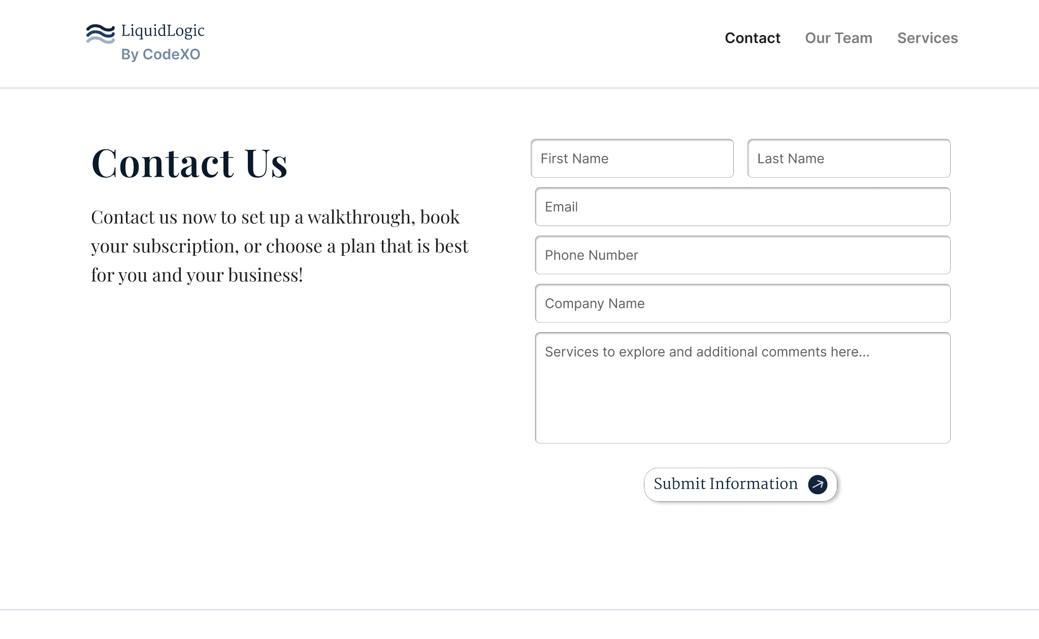
Preferring clarity over exploration, Bill opts to contact the team directly. He selects “Contact Us” to schedule a consultation and receive recommendations tailored to his business.
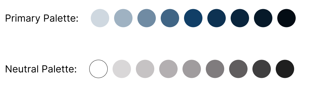
Using Coolors.co, we developed a palette of blues, white, and soft grays inspired by water, creating a calm and approachable visual direction. Blue was chosen as the primary color for its strong associations with trust, clarity, and reliability which are key qualities for a CRM platform introducing complex tools to new users. The palette was intentionally kept minimal to reduce visual noise and support comprehension.
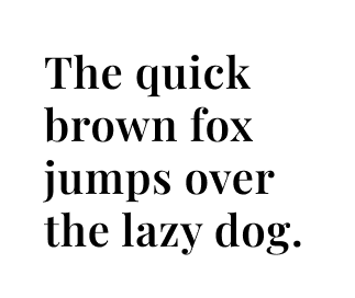
We selected a clean, formal typeface optimized for readability, ensuring that longer sections of content remained easy to scan and digest.
Style Guide & Branding
Primary: Playfair Display
Secondary: Inter
Color Palettes
The Final Prototype
A site promoting LiquidLogic: the pool based CRM software.
Reflections
Every minute counts in design and research.
This Designathon was a fast, hands-on experience where I led a team of two designers I had never worked with before. I was able to share techniques I had learned while also picking up new approaches through collaboration and iteration.
This design sprint taught me:
Every second counts. Every spare moment went into refining research, exploring visual directions, improving the prototype, or aligning with my team.
Collaboration unlocks better decisions. Our strongest ideas came from real-time discussions. When we worked together synchronously, we moved faster and made clearer design decisions.
Research shapes everything. Working with an unfamiliar user base exposed gaps in our assumptions. Stakeholder feedback ultimately pushed us to rethink aspects of our design to better match a blue-collar, straightforward audience.
Communication keeps momentum alive. This project strengthened my ability to organize a small remote team, delegate tasks, and maintain clarity across shifting priorities. It prepared me for longer-form project leadership.
Style guides and components will save your time, and mind. By setting up styles and components early, we were able to iterate quickly and make large-scale changes without rebuilding screens manually. (Life saver!)